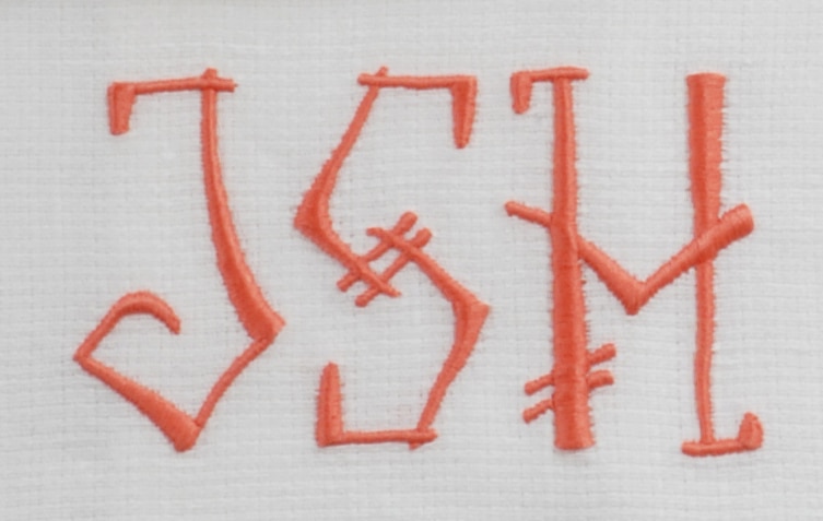
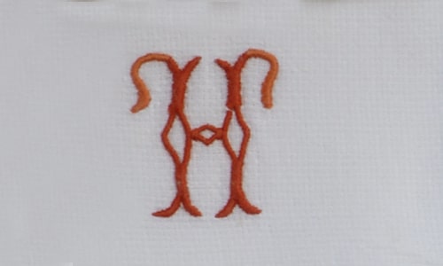
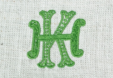
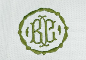
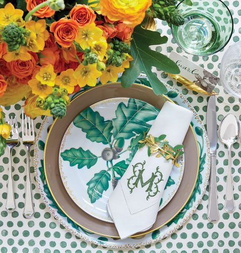
I was recently given a copy of Jane Scott Hodges book, Linens for every occasion and I have been pouring over every page. I found this article about choosing a monogram and I wanted to share it.
CHOOSING A MONOGRAM
While there is a long-standing tradition and etiquette to selecting your monogram and what initials to use, my philosophy is to not be beholden to any one doctrine or rule. In today’s world, I prefer to think of my monogram as something uniquely and perfectly suited for me and my personality.
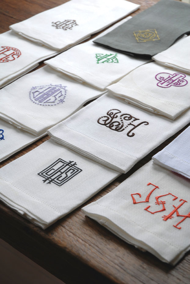
A sampling of monogrammed napkins in Jane Scott Hodges’ personal collection
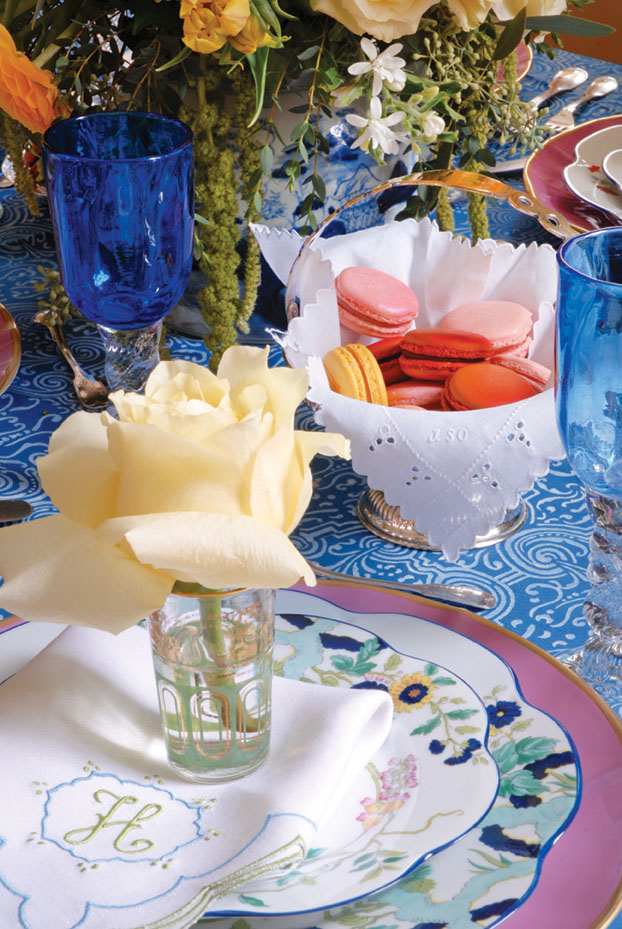
An embroidered napkin bearing a single-initial monogram tops Royal Limoges ‘Paradis Bleu’ plates and a pink charger by Anna Weatherley
Monograms are applied to all sorts of items, some for public show and some just for personal enjoyment. There are so many elements that make a monogram your own, including the initials you choose to combine, the letterforms themselves, the color combinations, and the item you are personalizing—all these things come together to create a truly bespoke item that is yours and yours alone. Here are a few things to consider when selecting your own personal design.
TYPES OF MONOGRAMS
TABLE LINENS TALK
GO CLASSIC. An ivory hemstitched napkin with gold monogram is the little black dress of tabletop. It gives warmth to the table, and is not as stark as white on white.
CONSIDER COLOR. I encourage the use of colored linens—they’re a game changer on the table and an important decorative element, just like the flowers or candles.
NAPKIN SIZE MATTERS. I mostly use 22-by-22-inch napkins. For a while those oversized “lapkins” were all the rage, but they can make place settings too crowded. It’s easier to work with a traditional size.

Leontine Linens founder Jane Scott Hodges in her New Orleans home
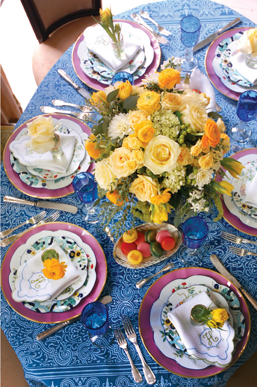
A centerpiece created by Margaret Ludwig of Giverny Design adds a burst of yellow to a blue table cloth Hodges found in Paris.
MAKE YOUR MARK. I founded Leontine Linens on the premise that monogrammed linens should be modern heirlooms—designs that speak to the moment but last forever. For me, that means adding color and scale. Traditionally in the South, monograms have been three letters—the wife’s first name on the left, married last name in the middle, and her maiden name on the right. But today there are so many different scenarios and I believe there are no rules, only what suits your style and family. In an intricate design, a single initial may be enough.
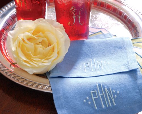
A monogrammed cocktail napkin belonging to Hodges’ husband features a straight across three-letter design.
TABLECLOTH OR PLACE MATS? IT’S A QUESTION OF PERSONAL PREFERENCE. For a recent luncheon I pulled out a tablecloth I bought on an anniversary trip to Paris with my husband. I always pick up things on my travels to add to my entertaining “prop closet,” as they add personality and bring back memories. But a lot of times I don’t use a tablecloth at all. I love square 15-by-15 place mats. They frame china nicely and give the same impression as a charger, and I can fit more settings around the table than with the standard rectangle. When the table surface itself is pretty, they really help show it off.
By Jane Scott Hodges, with excerpts from her book, Linens: For Every Room and Occasion (Rizzoli New York, 2014) | Photography by Kerry McCaffety | All monogram designs and linens from Leontine Linens


